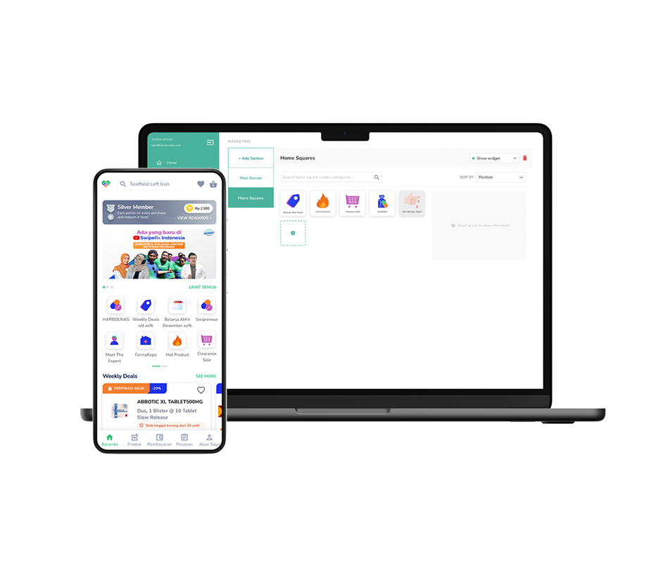
Quick Actions Improvement
Enhancing Homepage for Pharmacy Applications in Southeast Asia

Problem
The application homepage currently has static quick actions on the top of the page. The previous concept was the icon that displayed on the homepage.
It was ranked the lowest, with 0.09% conversion user click on the icon meanwhile, search ranked first with 35.19% conversions.
Solution
To tackle this issue, we proposed a redesign of the quick action features on the homepage, enabling customization through a marketing dashboard. This approach empowers the marketing team to craft targeted strategies that enhance customer retention and drive engagement, ultimately contributing to revenue growth.
Type
Mobile App and responsive website (content management platform)
My role
Senior UI UX designer
What I did
Benchmarking, User Stories, Wireframes, Interactive Prototypes, User Testing, UI design
Impact
- Achieved a 50% increase in the overall click-through rate (CTR) of homepage quick actions.
- Collaborated with the marketing team to refine strategies for engaging potential customers, leading to enhanced revenue prospects
The process
Problems
Scoping the problem
Based on the user research result, Most of the user search for a product using a search bar more frequently than category icon on the homepage and the result would come up right away once they typed the product’s name.
According to quick action optimization data, quick action’s click-through rate (known as category listing) was ranked on the lowest track on the platform using Mixpanel, with 0.09% conversion to clicks after viewing the home page. meanwhile, Search ranked first with 35.19% conversions.
The Pain Point
Understanding the users
At the start of competitive audits, I go through all the known e-commerce platforms and observe their working.
We found that personalization becomes more popular, customers are becoming less accepting of generic advertisements, resulting in a low click-through rate on the quick actions on homepage when compared to other call-to-action buttons.
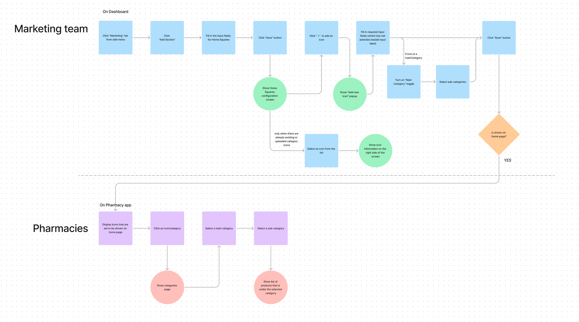
Following the defined in the pain point, my colleague and I started working on the wireframes for the app interface start to create user journey on Figjam for this project

Prototype of the solution
I immediately began developing high-fidelity prototypes in Figma to explore design opportunities and assess ease of use. To ensure the redesign meets users’ needs, we conducted usability testing.
As this project aims to be flexible for the marketing team, I established guidelines for icon dimensions and graphical elements, ensuring consistency and clarity.
Usability Test
Our usability tests evaluated users’ interactions within the platform. Feedback indicated that users could easily access additional categories beyond what was immediately visible on the homepage.
